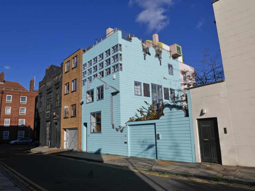
Twenty years ago an architectural bomb went off in Hackney, east London. It was a small and charming bomb, with no reported casualties, in a colour somewhere between baby blue and sky blue, with curious shapes – old Dutch gables inspired by a postcard of Amsterdam, the outline of a tree, a child’s idea of a house – cut into its boarded exterior. But it performed an act then outrageous in architectural circles, of reviving postmodernism, the decorative style tainted by its association with the bloated office buildings and shopping malls of 1980s corporate excess.
The Blue House, as it is called, helped to bring some fame though not much fortune to its architects, Fashion Architecture Taste, or FAT, until they announced their breakup in 2013. It didn’t, though, greatly alter the trajectory of architecture. It didn’t launch a revolution of what you might call postpostmodernism. Its big idea was that architecture could be like pop art, that it could combine artistic sophistication with a direct appeal to everyday culture, that it could riff on themes from notable architects of the past while offering imagery that a child might get. So the gable and tree shapes came with a layered and complex interior that owes something to Adolf Loos and John Soane. The world somehow wasn’t ready for this.
In the past few years, however, there has been a gradual exploration of the waters that FAT boldly entered when the century was young. Postpostpostmodernism, perhaps. One manifestation is the Red House, a new home in Dorset for an art dealer, his accountant husband and their young daughter. It is designed by David Kohn, the architect who, with the artist Fiona Banner, created a temporary one-room, boat-shaped hotel perched on the Queen Elizabeth Hall in London.
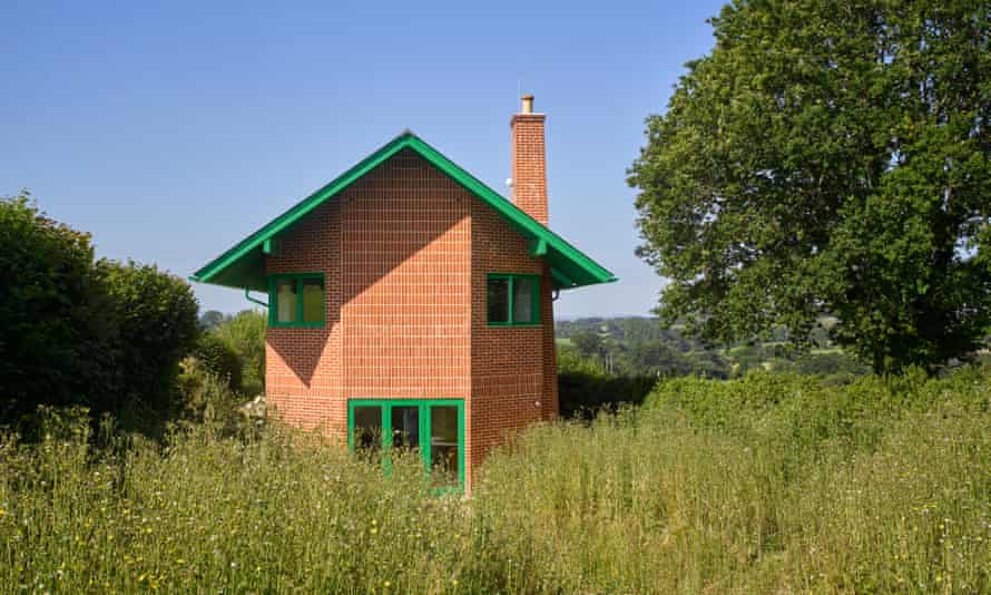
Red House is a long, two-storey oblong with a big, oversailing slate roof. It has high chimneys, curving bays and openings in the shapes of circles and semi-circles. The windows and door of an end elevation recall the eyes and mouth of a face. Complementary colours zing off each other: a vibrant green for the metalwork and timber, and red brick walls. It plainly announces, almost cartoonishly, that it is a house. At the same time it offers clues and diversions for the architecturally learned. It has a clear debt to the Arts and Crafts houses of around 1900, built for enlightened patrons in such places as the Lake District, the Malvern hills or what is now the London green belt. It is particularly reminiscent of CFA Voysey, the leading exponent of that style.
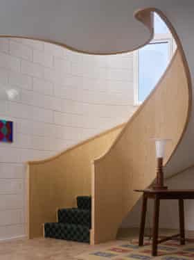
It also has a bit of the mid-century Philadelphian Louis Kahn, a romantic devotee of massive masonry, and something of James Stirling, the British architect who from the 1950s until his death in 1992 delighted in clashing powerful forms and colours. Inside, on the first floor, there’s a vaulted corridor inspired by the Villa Necchi Campiglio in Milan, whose exquisite 1930s interiors made a memorable setting for the Tilda Swinton-starring film I Am Love.
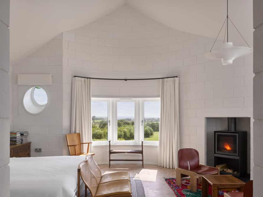
The house is composed, as in a piece of music, with complexity and difference playing off an overall structure. Inside, there’s an axis running down the centre of the house, leading you towards the views of garden and landscape beyond, around which contrasting spaces are arrayed: a semi-circular dining space, a bright kitchen, a study alcove opening off the first-floor landing, a master bedroom in which the concave curve of the inside of a bay meets the triangular shape of the underside of the roof, to subtle and tent-like effect. A stair with rococo curves connects the two floors. Ample storage spaces, which help to keep the interiors uncluttered and orderly, punctuate the plan.
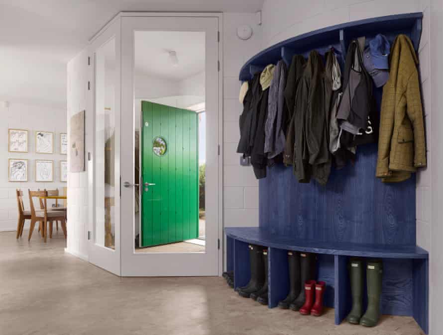
Rooms are high or low, expansive or constricted, with light coming from different angles and views offered in multiple directions. The scale is a little surprising: passages and doors, partly out of a wish to make the house wheelchair accessible, are higher and wider than normal. At the same time the interior is finished with calm and consistent practicality – white-painted concrete block walls and wood block floors – which brings overall coherence to the variety of shapes and spaces.
On the outside, bricks are laid horizontally, as is conventional, but sometimes vertically. There’s a logic to this that may be lost to the casual observer, which is that the vertical bricks denote the location of more functional spaces, such as bathrooms and store rooms, that serve the main living spaces. There’s also a slight overhang in the brickwork at first-floor level. Again, it’s a nicety that many won’t notice, but even though this and the brick patterns add to the cost, Kohn’s clients were happy to pay for it. The house is (among other things) a work of art, is their view, and its architect should be trusted to do it his way.
Both the Blue House and the Red House play with your expectations of scale, surface and appearance. What looks flat might be substantial, and vice versa. In both, the outside tells you something about the inside, but not precisely. The Blue House, which included a studio as well as a home, has both the gridded windows of a workplace and domestic pitched-roof shapes, but they don’t correspond to the locations of these uses within. The Red House is the politer of the two, where the multiple elements are more assimilated with one another.
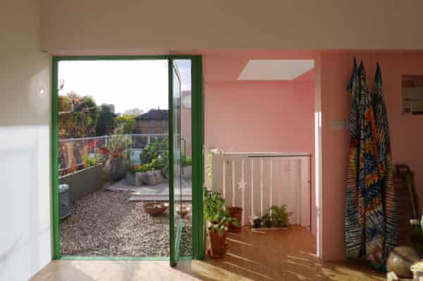
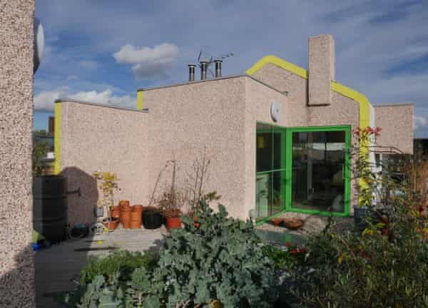
The Blue House takes greater pleasure in its incongruities, to which another layer has now been added. It was originally built for Sean Griffiths, one of FAT’s founders, and his then-partner, the landscape architect Lynn Kinnear. The two no longer live together, but Griffiths has designed for Kinnear an internal makeover and an extension at the top of the house that includes a contemplative study opening on to a roof garden. The new work is completely different from the original, but it has the same spirit.
Here, new materials and colours are added to what was already a rich palette – pebbledash walls, a profiled metal roof, pink, yellow, green. The rooftop structure adds another house shape to those already present, plus a somewhat brutalist projecting window. “A beach house on the roof”, Kinnear calls it, and the interior is a surprisingly serene escape, with views of London chimneys and towers. “What the rest would have been like if I’d been a good architect back then” is how Griffiths describes it.
Kohn doesn’t see himself as a disciple of FAT, exactly, but he shares some of their interests and appreciates their “huge generosity”. He says that they “did a brilliant job of expanding architecture, of trying to prise open what’s fair game. It was a project for recovering a lot of lost fun.” Perhaps now, at last, the architectural world is ready to hear their messages.


More Stories
Victorian House Style Ideas That Radiate Elegance
Eco Friendly House Style Ideas for Sustainable Living
Current Obsessions: Post-Gatherings – Remodelista